These are different book covers for 1984, the novel by George Orwell. This book is set in a bleak future where a totalitarian government enforces control by eliminating privacy and instilling fear in its citizens.
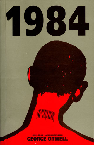 This is the Indonesian cover for 1984. It may not necessarily fit with the story, since people in the book aren't necessarily bar-coded. However, it may symbolize how people in the book are not seen as individuals.
 The big, colorful balloon-type letters against the blank background don't exactly fit with the tone of the story. As stated earlier, this story is about a bleak, dystopian future. The letters give off a cheerful tone.
This cover is stark and simple, with a single piece of torn paper saying "Nineteen Eighty-Four". It doesn't give us much information about the book itself. However, that may be a good thing to stir up the curiosity of those wanting to read the book.
 This cover shows Big Brother juxtaposed with the tagline, "Big Brother is Watching You". In the lower-left corner, there is a rat. The rat is an important symbol in the book, but revealing what it symbolizes may spoil the book for those who haven't read it yet.
 This cover was shown to us in class. Let me say that this cover is both unintentionally hilarious and inappropriate in many ways. First, the woman in the foreground is supposed to be part of the "anti-sex union", and yet she's wearing a cleavage exposing uniform, which ends up being seductive. Second, the man in black seems to be wearing a disturbing type of leather uniform, making him look like an S&M man. Also, everyone seems to be wearing sleeveless uniforms, even though they wouldn't be wearing this in the book. This cover is pretty unfitting. In fact, the cover makes the book look more like pornography than anything.
 This cover is fairly recent. The cover depicts an eye in the middle of what appears to be a Communist-styled poster, evident in its use of black and red. The eye is supposed to symbolize how everyone in the society is being watched by Big Brother.
 This cover shows Big Brother juxtaposed with the tagline, "Big Brother is Watching You". In the lower-left corner, there is a rat. The rat is an important symbol in the book, but revealing what it symbolizes may spoil the book for those who haven't read it yet.
 This cover was shown to us in class. Let me say that this cover is both unintentionally hilarious and inappropriate in many ways. First, the woman in the foreground is supposed to be part of the "anti-sex union", and yet she's wearing a cleavage exposing uniform, which ends up being seductive. Second, the man in black seems to be wearing a disturbing type of leather uniform, making him look like an S&M man. Also, everyone seems to be wearing sleeveless uniforms, even though they wouldn't be wearing this in the book. This cover is pretty unfitting. In fact, the cover makes the book look more like pornography than anything.
  This cover is fairly recent. The cover depicts an eye in the middle of what appears to be a Communist-styled poster, evident in its use of black and red. The eye is supposed to symbolize how everyone in the society is being watched by Big Brother.